OUTspoken Re-Brand


For the organization I work at, I led an initiative to redesign our brand from the ground up, creating new logos, picking out typography and colors, and designing social media graphics and icons.
Background

OUTspoken is a Student Government organization at RIT that advocates for LGBTQ+ students and provides free resouces, hosts events, and coordinates all LGBTQ+ clubs at RIT.
Not only did OUTspoken's old logo struggle to convey the purpose of the organization, it also lacked versatility.
A New Logo
The core challenge was how do you create a symbol for the Queer community that doesn't rely on a rainbow?
Some of the most commonly used symbols derive from the Venus and Mars symbols (⚢, ⚣, ⚧). But there is no single symbol that unites both sexuality and gender.
Another option was the Greek letter lambda (λ), associated with the Gay Activists Alliance. However, this was a dead-end as the GAA notably downplayed the contribution of transgender activists to Queer liberation.

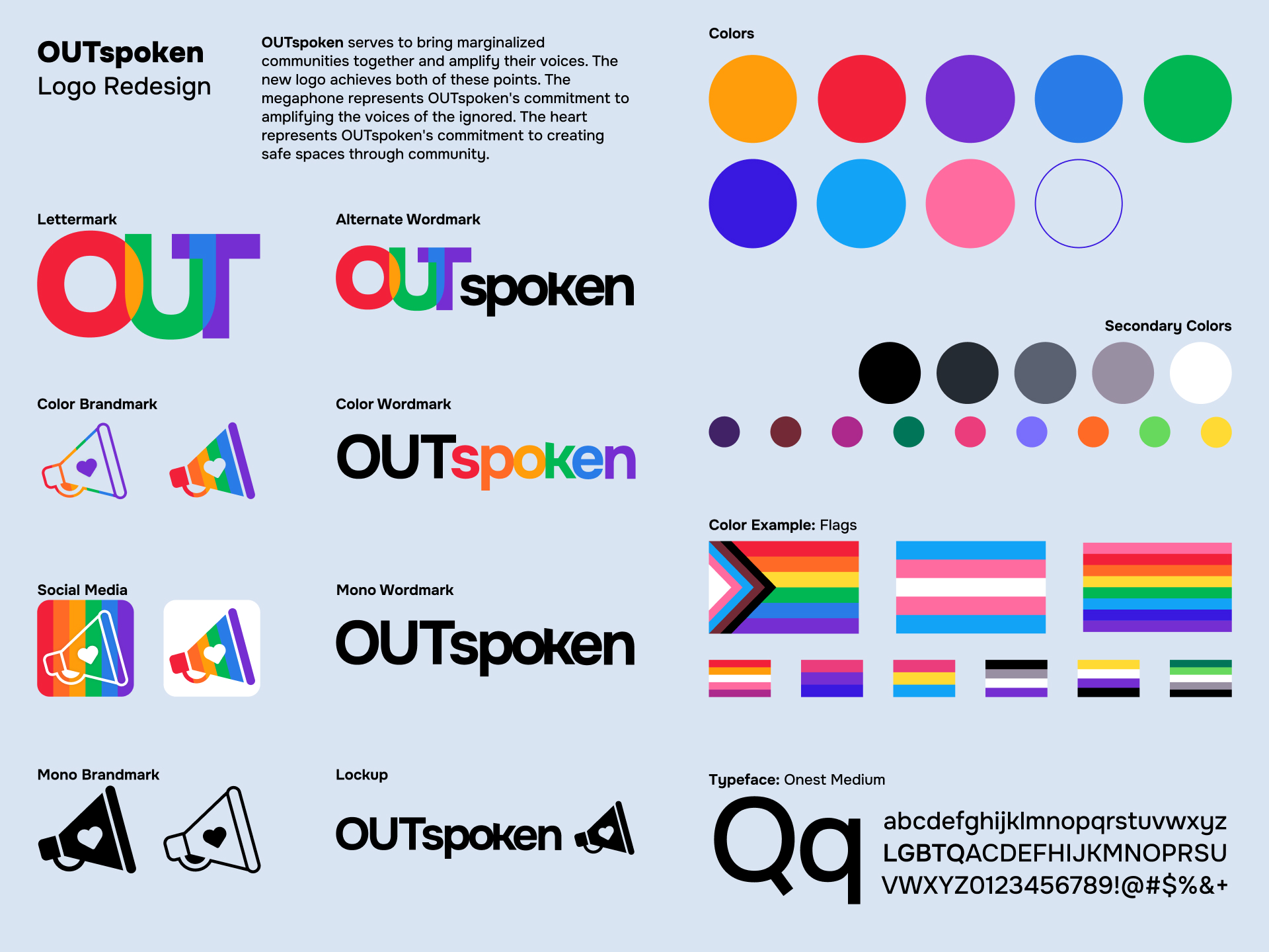
We settled on a heart, a simple and universal symbol of love and unity. When possible the logo is used alongside rainbow colors; but even in its monochrome form, it still represents OUTspoken's committment to unity.
As for OUTspoken's role in Student Government, we use a megaphone to represent OUTspoken's commitment to amplifying queer voices. The logo doubles as a nod to the "spoken" in the organization's name.
Colors and Flags

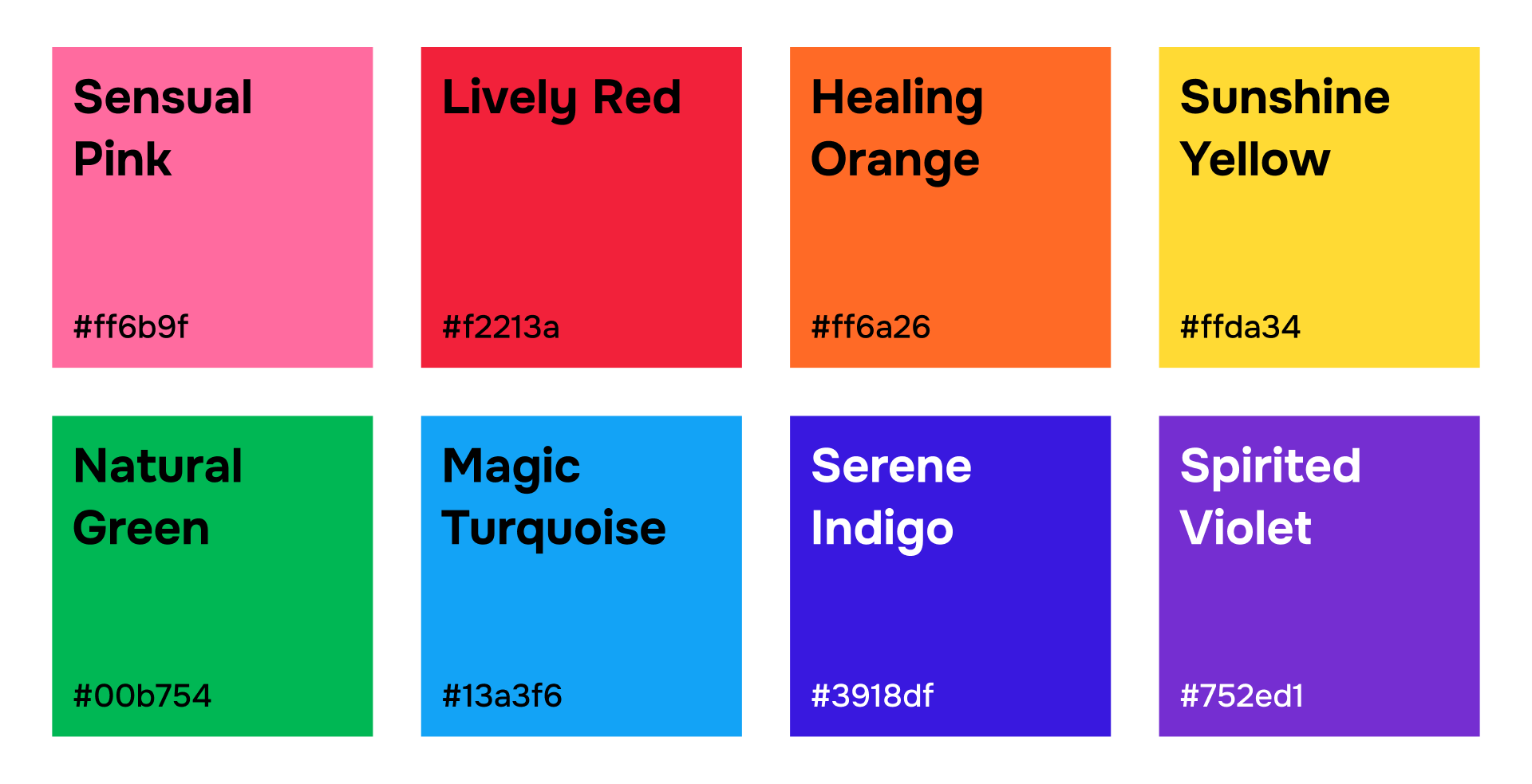
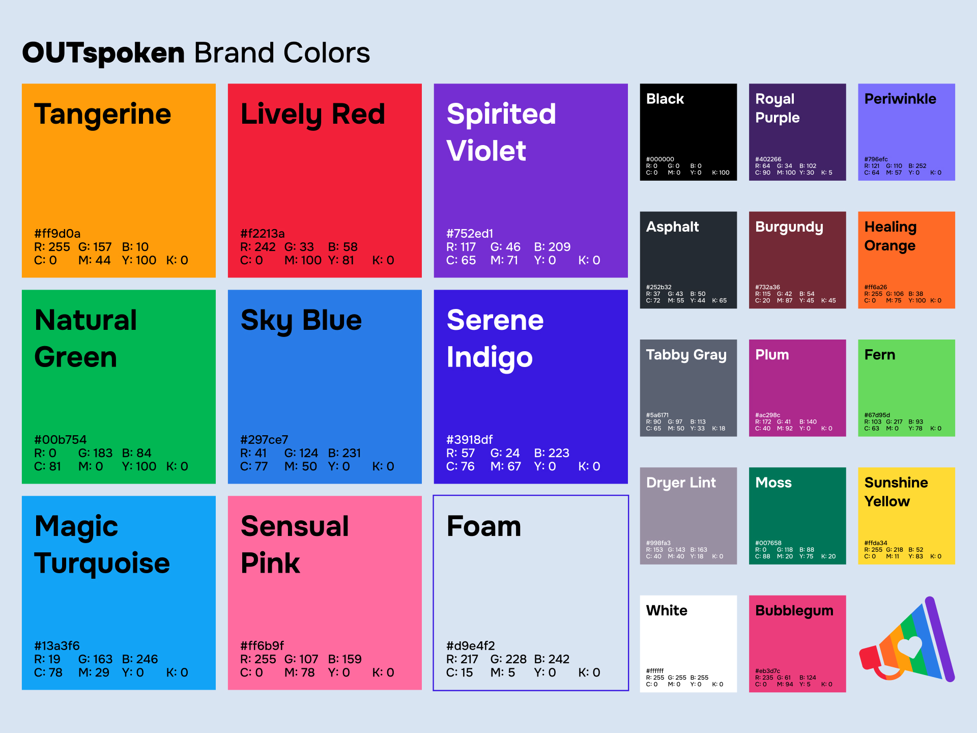
We started with the eight colors of the original pride flag, designed by Gilbert Baker in 1978. We then expanded the colors to allow for a wide range of pride flags to be made using OUTspoken's colors.

The Finishing Touches
All that was left to do was add some neutral tones for typography and put together the wordmarks, lockups, and social media icons!


